Simply Online
Counselling
Logo Design
Counselling
Logo Design
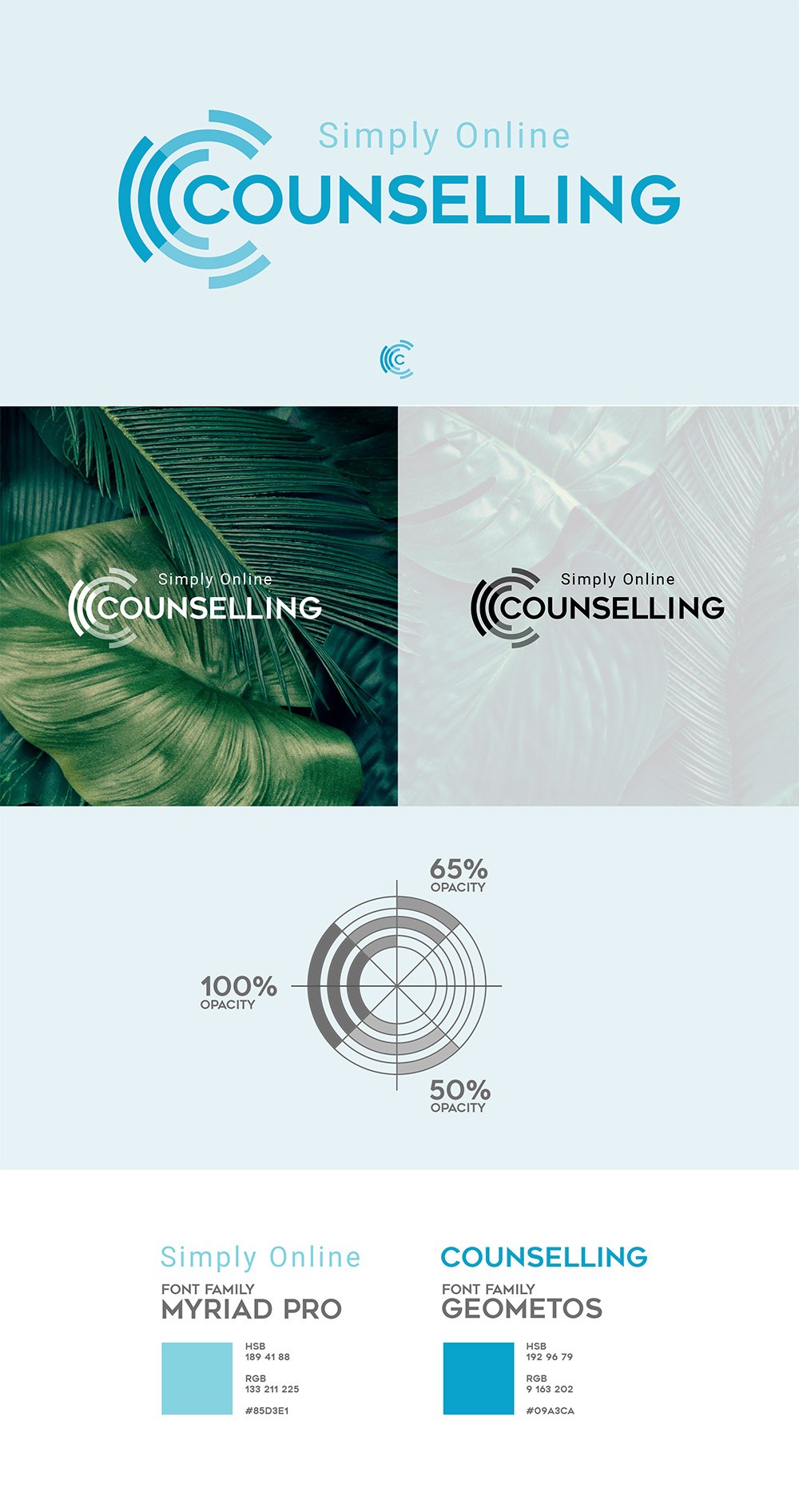
The logo icon was designed based on three concepts: the visualisation of a hug, creating a connection between the user and the product, and the “C” within the company’s name.
Developing the radial shape of the standard logo, the web format was then animated with a three rotating rays. The design both demands the user’s attention and wraps the text to give a sense of trust and protection.
Developing the radial shape of the standard logo, the web format was then animated with a three rotating rays. The design both demands the user’s attention and wraps the text to give a sense of trust and protection.
Illustrator
User Journey &
User Flow
User Flow
The client required a site for people to easily access online conselling who might otherwise avoid seeking help.
The goal was to make the site accessible and welcoming, to showcase the available therapies, to buy credits, and to begin a conversation with a counsellor.
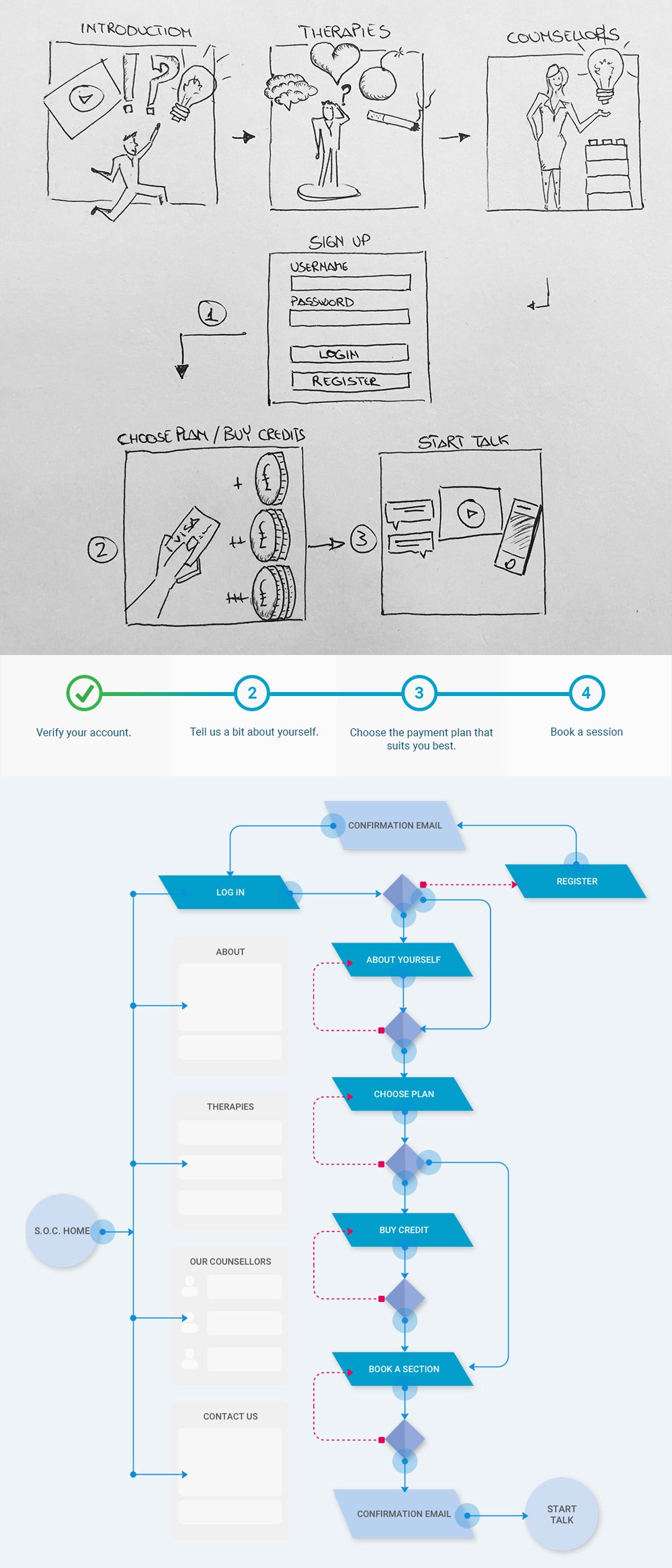
I created a User Journey and a User Flow to show how the site should work. The main steps are:
1) Five pages to showcase the site
2) User registers
3) User tell us about themselves
4) User chooses a plan
5) User buys credits
6) The user is matched with a counsellor and waits for a confirmation email
7) User starts a conversation with a counsellor
UX
Wireframe Sketch
Wireframe Sketch
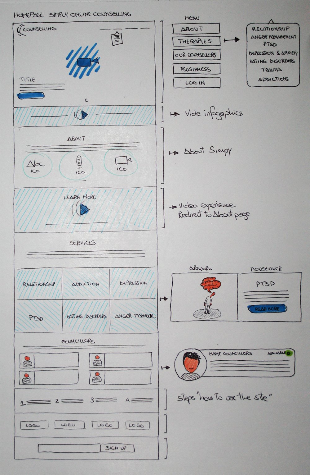
Reflecting the title of the company, I focused on keeping the structure simple with clear steps for the user to follow.
Bearing in mind that the user may be in a state of distress, it was important to make the usability simple, logical, and straightforward.
Bearing in mind that the user may be in a state of distress, it was important to make the usability simple, logical, and straightforward.
UX
Wireframe
Wireframe
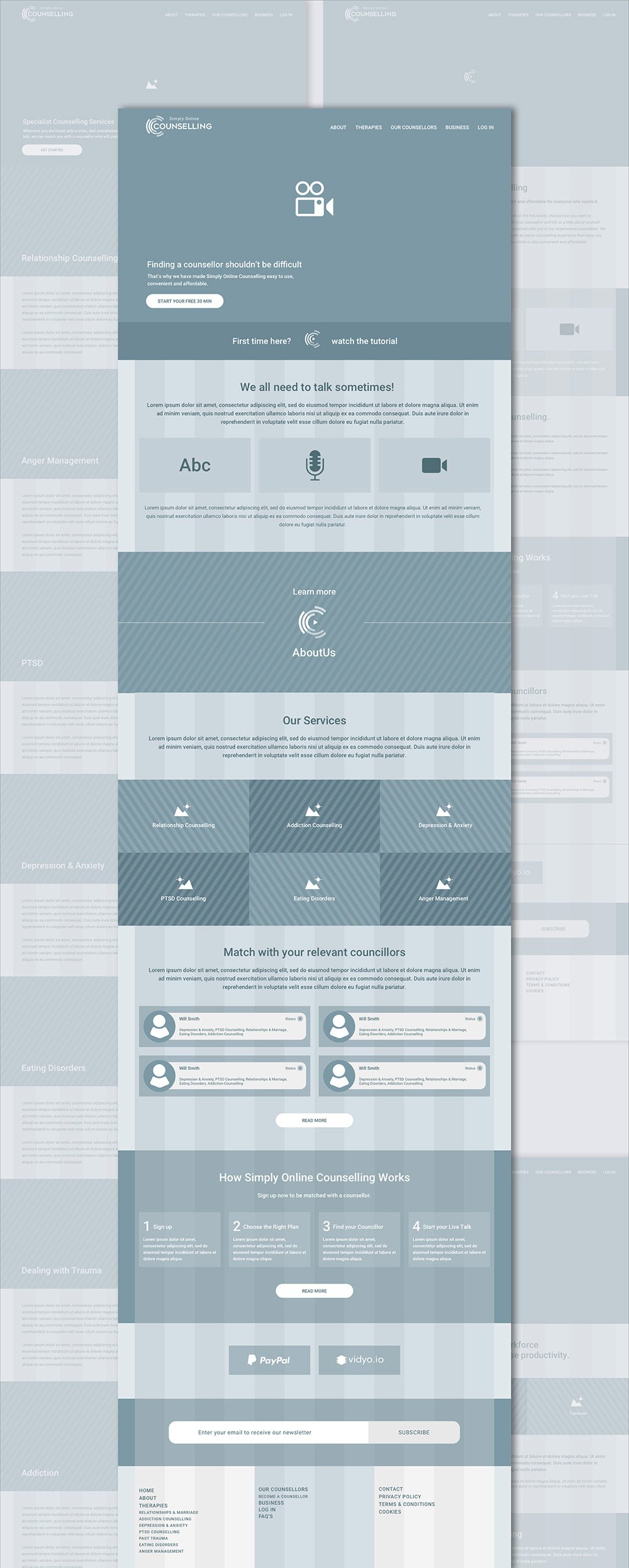
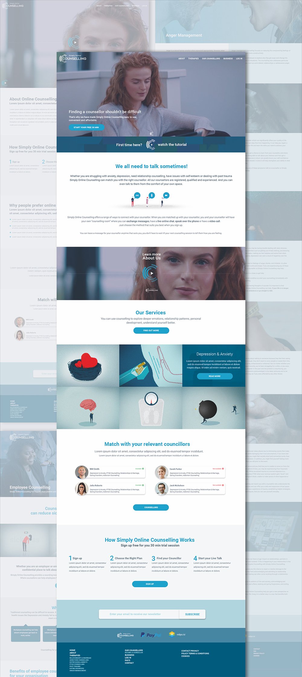
The home page quickly synthesises key points from the other internal pages in order to immediately give the user a clear overview of the service provided.
All the site presents video, illustrations, interactions and short, easy-to-understand sentences.
All the site presents video, illustrations, interactions and short, easy-to-understand sentences.
Sketch
UX
Prototype
Prototype
The prototype was designed with Sketch and built with Flinto.
I developed the prototype to maximize user engagement, develop interest, and create a sense of interaction with the user.
This includes the following:
Transitions between the block sections which appear with an animation from bottom to top with an opacity 0 to 100.
Play and Stop video buttons use the logo circle which rotates 360 degrees on the mouse hover.
The therapies section presents text animation on mouse hover.
Flinto
UI
Visual layout
Visual layout
Custom illustrations and icons were created for each of the different services. An abstract and simplified style was used to reflect the feel of the site; calm, logical, ordered, and supportive.
Empathic images were sourced and included before each section of the therapies pages to emphasize the description.
Empathic images were sourced and included before each section of the therapies pages to emphasize the description.
SketchPhotoshop
UI
Mobile layout
Mobile layout
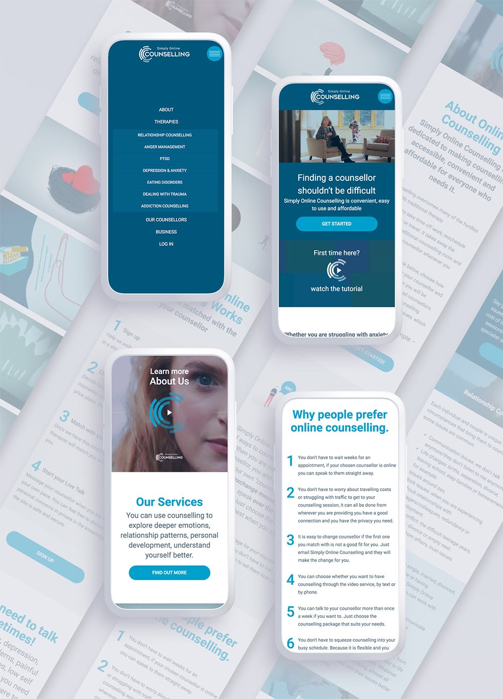
From the previous UX design structure the site became responsive for all devices.
Sketch
Product
guidelines
guidelines
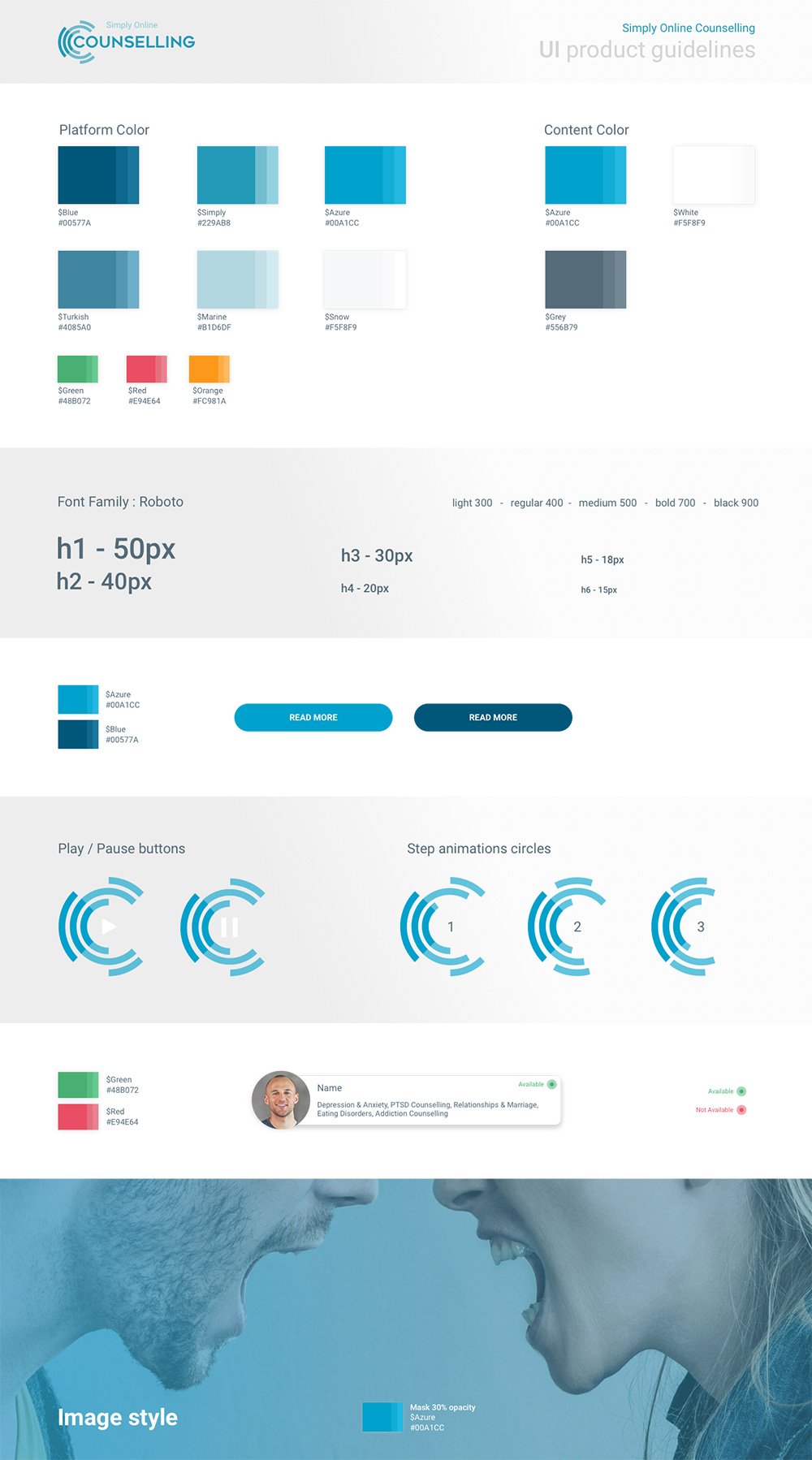
I decided to use an azure color to give the site a sense of safety and reliability.
All the images were given an azure shade to match the site.
Font family, font size, color, buttons, padding and image style are defined inside the product guidelines.
All the images were given an azure shade to match the site.
Font family, font size, color, buttons, padding and image style are defined inside the product guidelines.
Sketch
Front End
Development
www.simplyonlinecounselling.co.uk
Development
As well as the Design aspects, I was also involved in Front End development; I took responsibility for the structure of the site, style sheets, responsive CSS and CSS animation.
All pages was built from scratch, strictly adhering to the Visual Layout.
Wordpress CMS was used to ensure that the client could easily update the contents.
All pages was built from scratch, strictly adhering to the Visual Layout.
Wordpress CMS was used to ensure that the client could easily update the contents.
WordpressHTML5SASSPHPjQuery
.