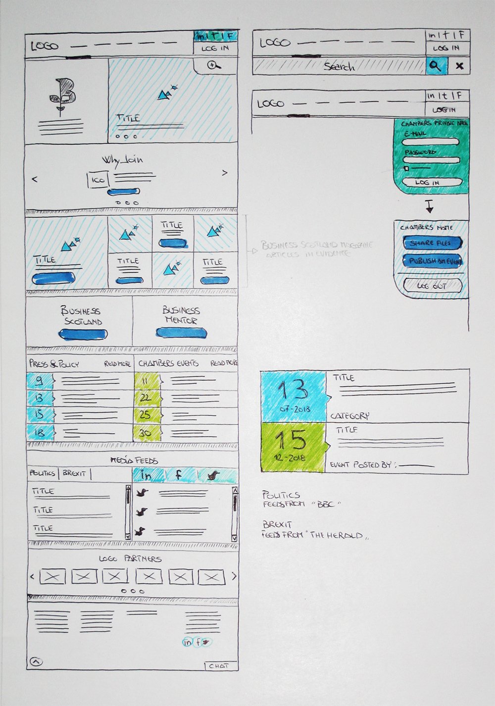
UX
Wireframe Sketch
The challenge of this site was how to engage with new users, and also to provide a structure for existing members to access continuously updated content and information. This led to the idea of dividing the site into different areas with articles, news & events, and social media feeds, to clearly direct site traffic.
The site also presents a private area where the various chambers can post events and share files.
UX
Wireframe
In order to respond to the differing needs of users, the first section of the home page was designed to quickly explain to new users what the Chambers does and benefits of membership. The second section shows recent publications as well as a quick over-view of press, news and events.

The other pages respond to their specific content whilst matching the general structure of the homepage. For example, in order to show quickly and clearly where the other Chambers are located, I developed a map with location-pickers with relative contact information.
Sketch
UX
Prototype
The transitions between pages and gestures inside each component were defined by the prototype.
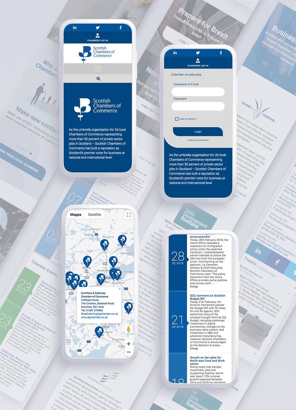
In order to engage with the user and make the site more modern and less institutional, I created various kinds of animation; I designed a drop-down log-in menu, an expandable search bar, content sliders, and mouse-hover buttons. These reflect the authority of the business but in a contemporary style to attract new members.

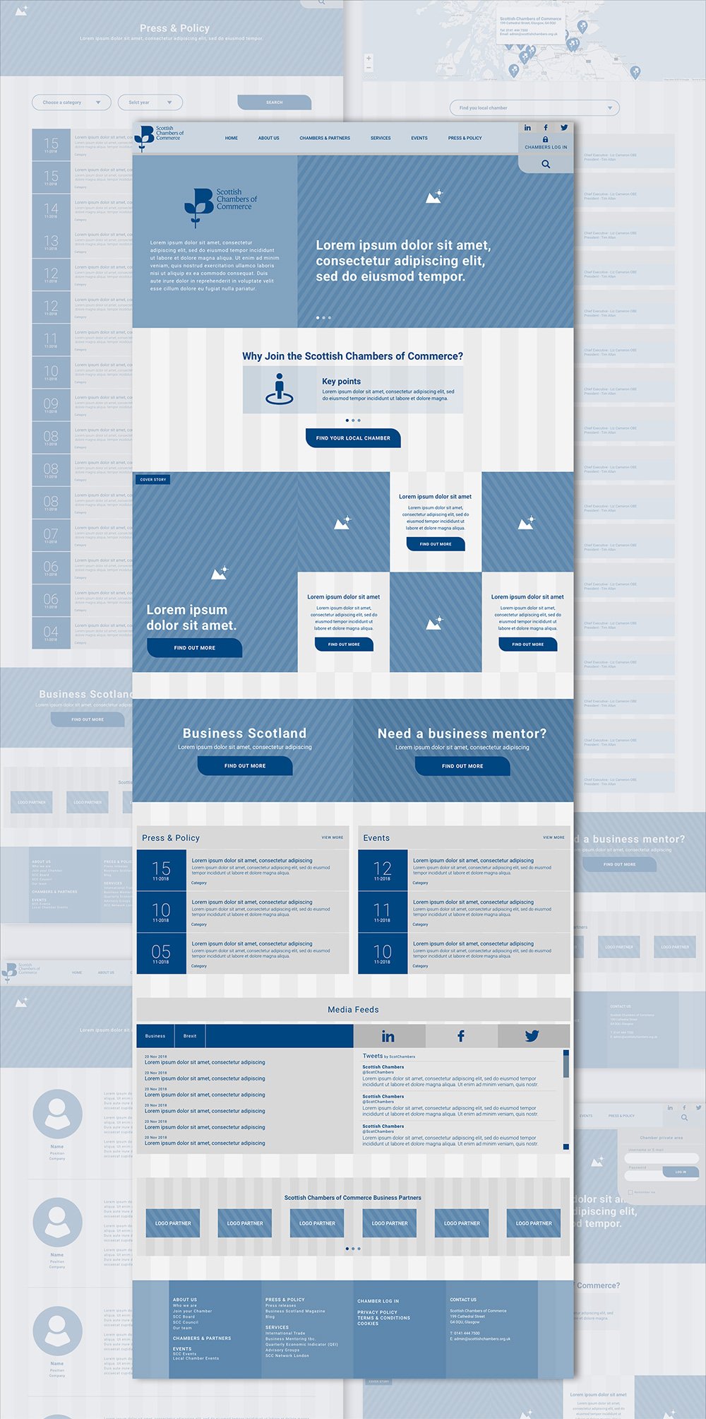
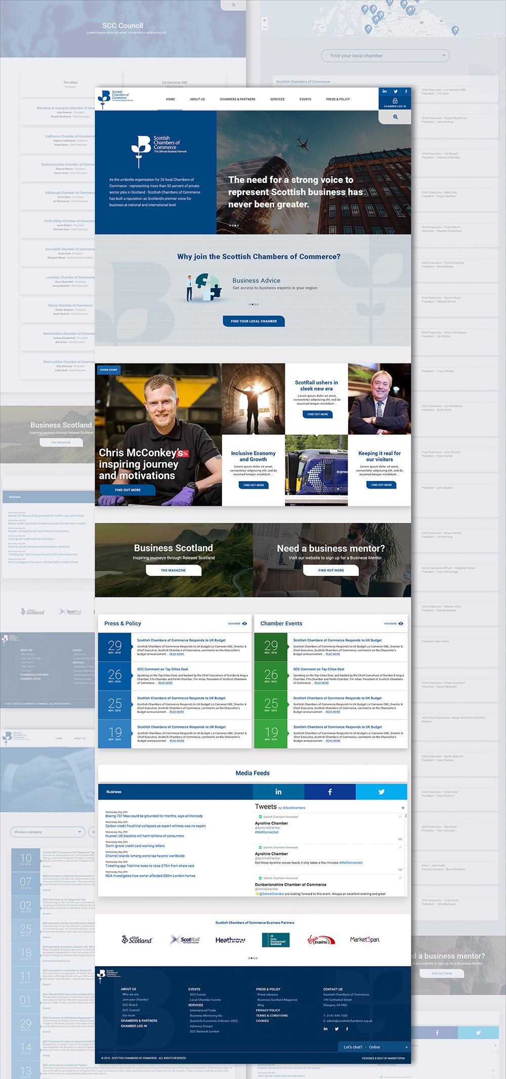
The nature of the organization means that the site includes a vast amount of information so it was important to simplify the design as much as possible.
For example, because of the extensive list of Chambers, I designed a drop-down list where the user can find their local Chamber by filtering and minimizing the full list with animation.
Flinto
UI
Visual layout
The layouts were kept clean, clear and simple to allow attention to focus on the content.
White space and shadow between sections was used generously to ensure breathing space and to give depth.
As the users of the site are familiar with the business sphere, the visuals of the site were kept rational, systematic, and orderly to reflect the nature of the sector.
Sketch
UI
Mobile layout
The previous block structure define inside the wireframe consent to become responsive and simple to use on mobile devices.
Sketch
Product
guidelines
A royal blue was chosen for the site to give a sense of authority, institution, and order.
Product guideline designed to be consistent with fonts, colour, buttons, padding and image style.
Sketch
Front End
Development
www.scottishchambers.org.uk
I was also involved in both Front End and Back End development, so as well as creating a file sharing system and membership permissions, I also took responsibility for the structure of the site, style sheets, responsive CSS and CSS animation.
Wordpress CMS was used to ensure that the client could easily update the contents.
WordpressHTMLSASSPHPjQuery

.