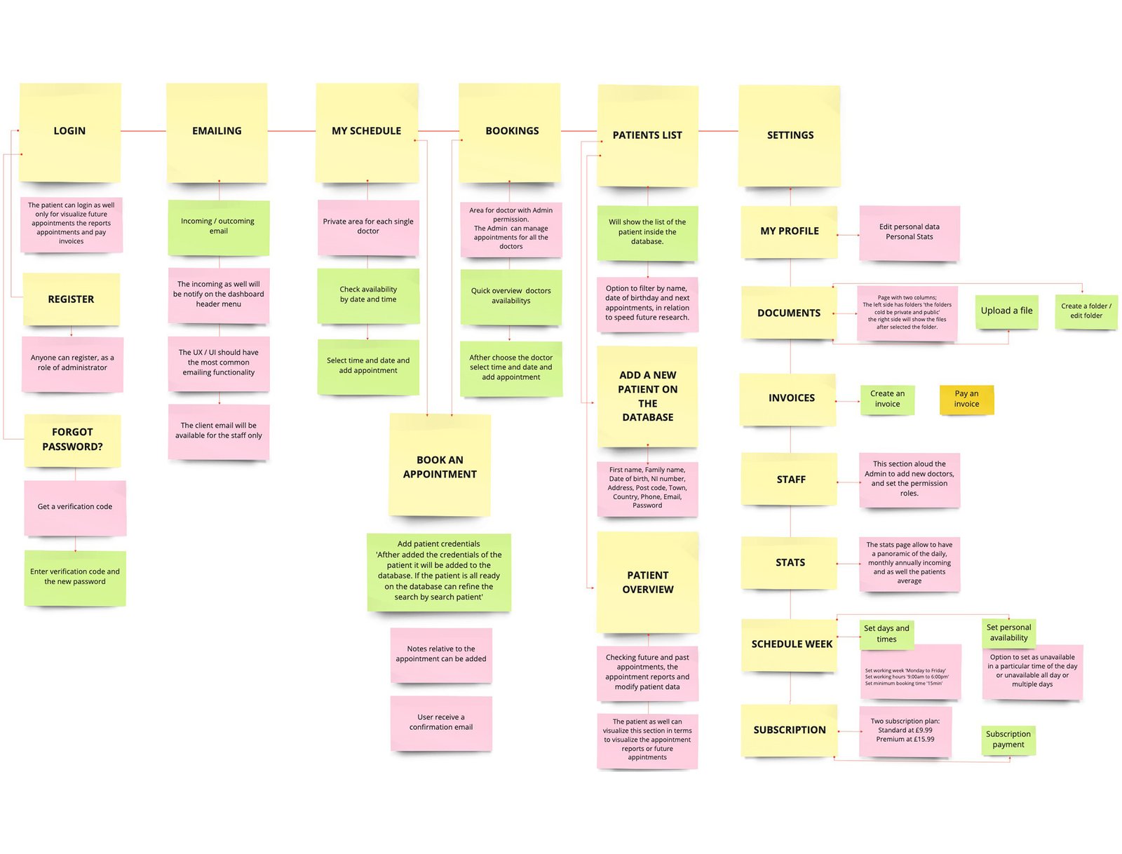
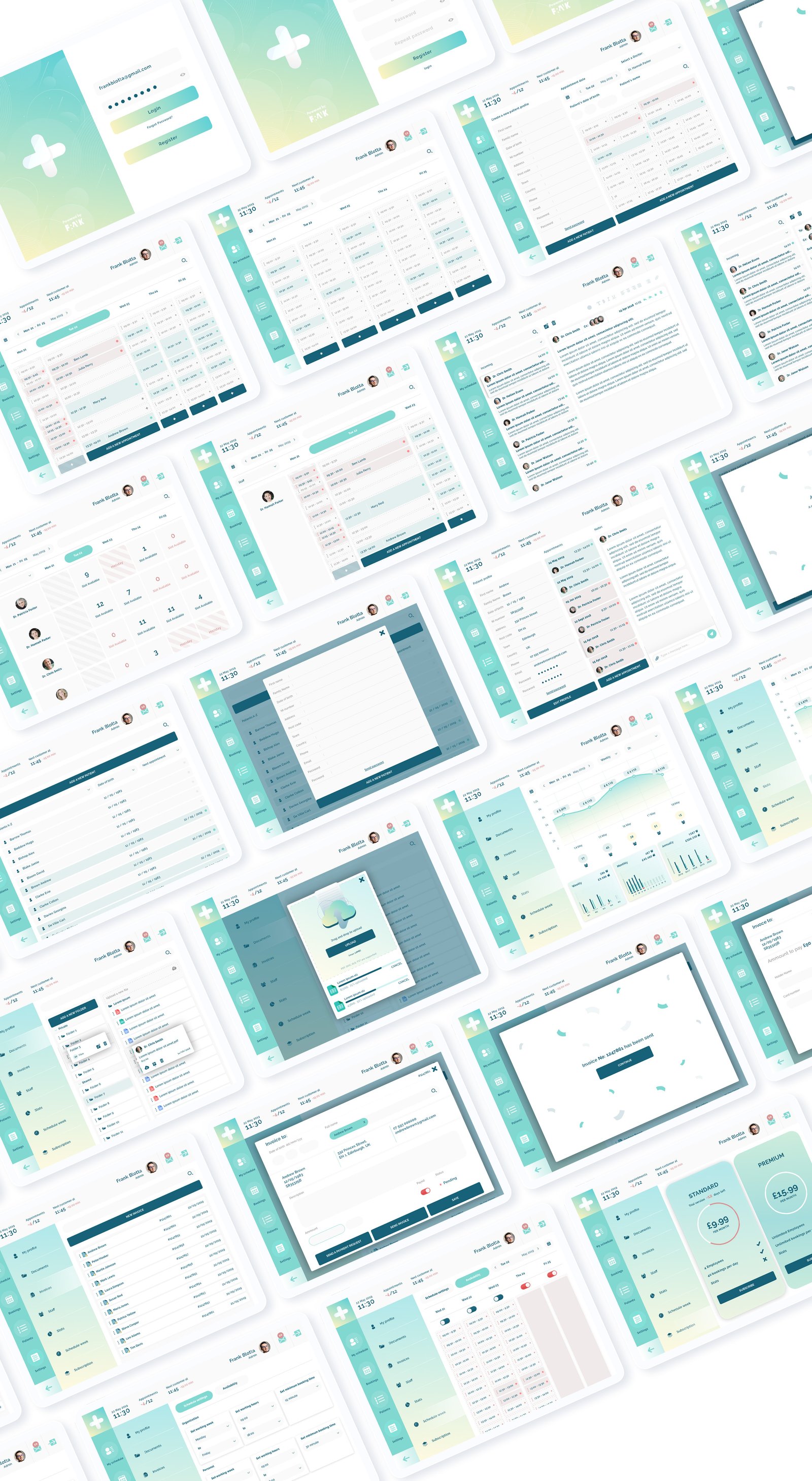
For the booking section the challenges were;
structural: how to simplify the design, giving to the user a quick and clear vision of the daily availability and a fast booking; and
functional: how to simplify the steps the users will do during the booking process.
Solutions.
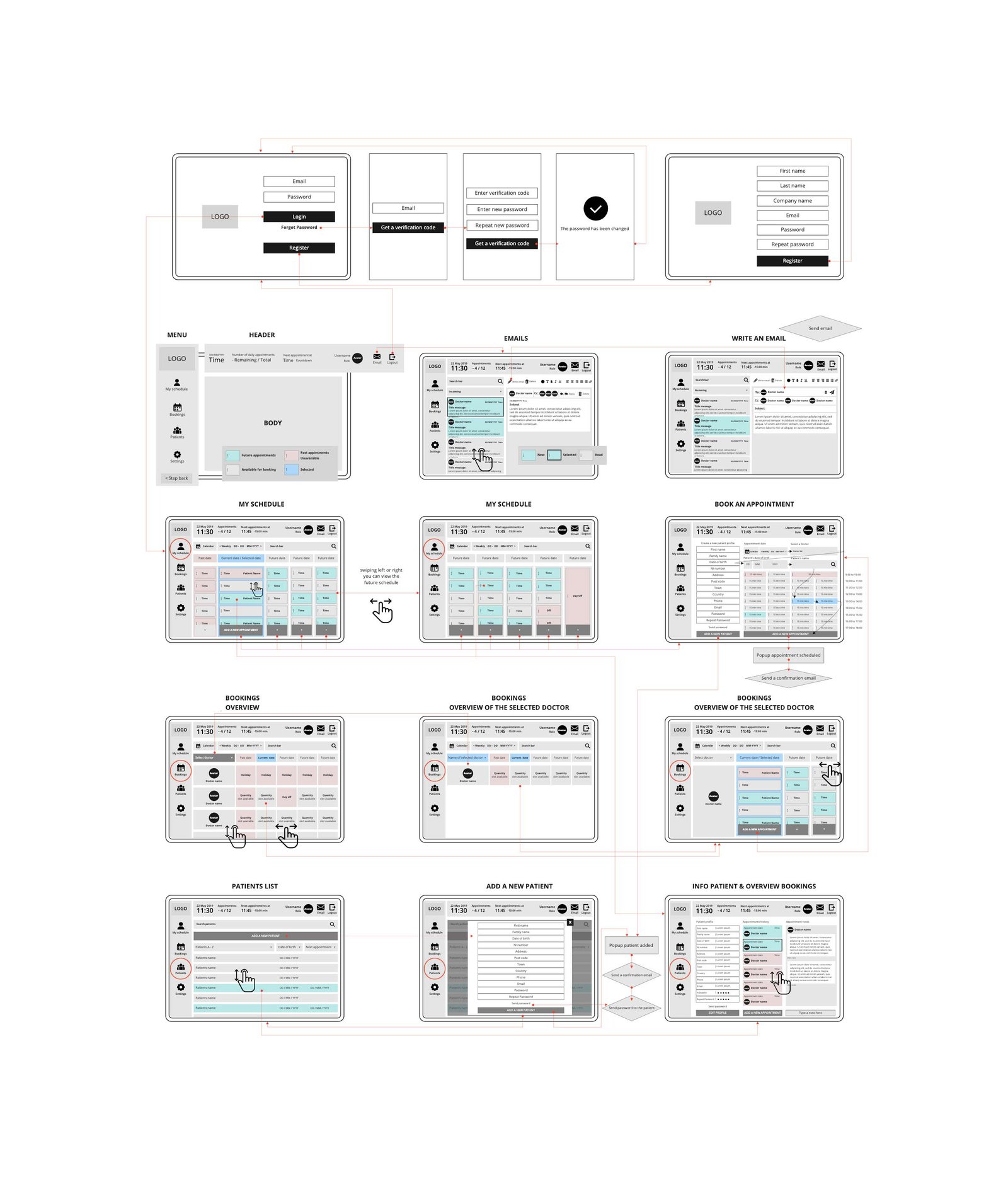
I started to design a wireframe to help me to develop a structural vision and identity.
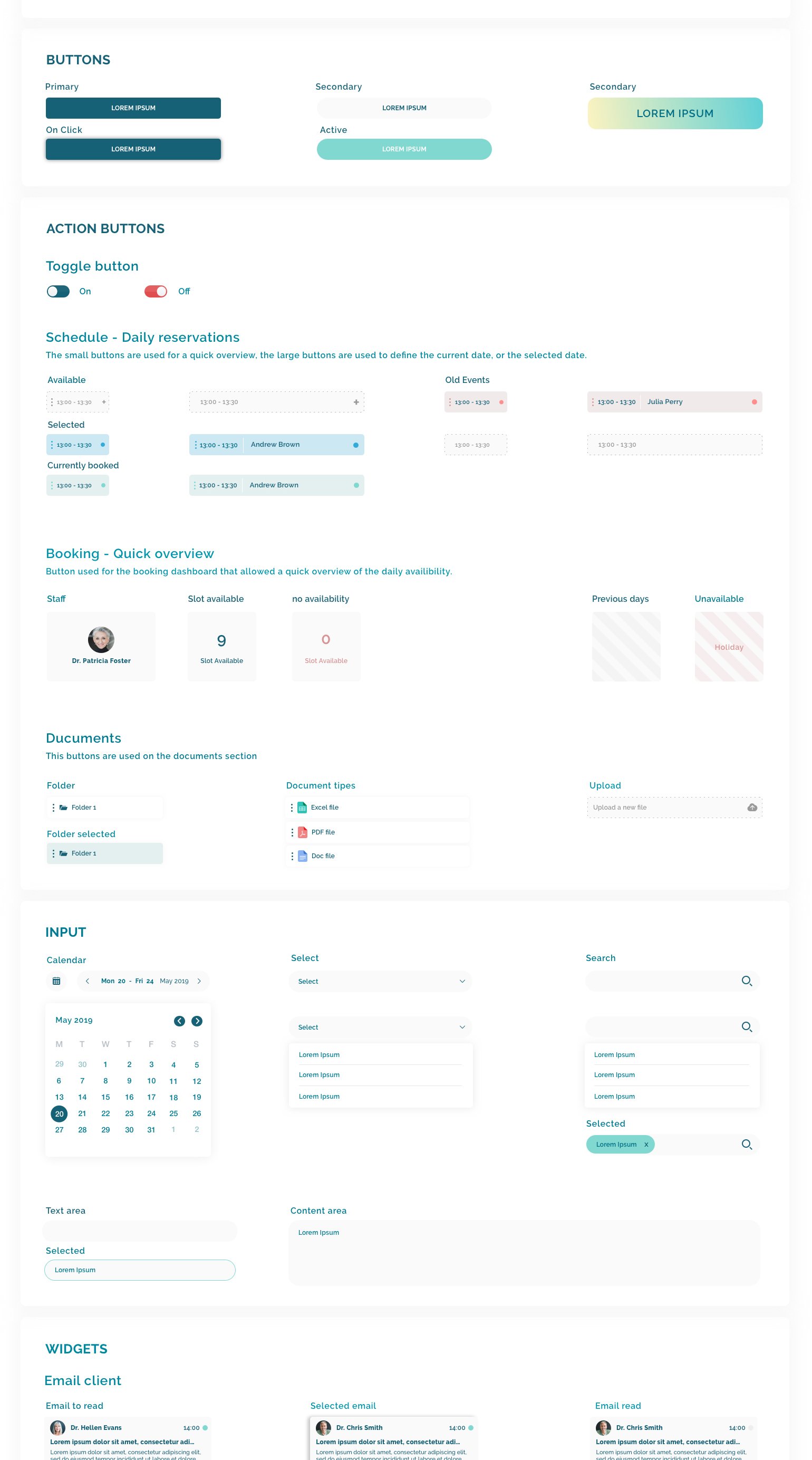
Structurally - I created a table for the doctors where each row corresponds with a doctor and in each cell the daily availability is displayed.
Functionally - Clicking inside the daily cell/slot redirects to the relative doctor's page with the daily bookings. Here, it is possible to see the timetable which includes past and future appointments, free space to allocate new appointments, and the option within the cell to select the time and book the appointment.
To simplify and speed-up site management, I also allocated three core sections in the menu on the left-hand side:
My schedule,
Bookings and
Patients.
- My schedule is a private area dedicated to the healthcare professional, which allows them to manage their own appointments.
This section has a calendar structure where the user visualizes their daily bookings and can add new appointments.
By default, I decided to dedicate a fifteen-minute time slot for each appointment, but that also can be incremented progressively in the reservation section, or the default slot time can be customized in settings.
- Bookings allow only the administrator or those with admin permissions to have a quick view of all the bookings and manage the bookings for all the employees.
- Patients: this section allows users to register new patients in the database, and keeps a record of past and future appointments. This is also integrated with an area where it is possible to add a report for each appointment.