APS is a leading professional institution in the field of construction health and safety risk management, helping people manage risk and implement building regulations effectively and proportionately.

The problem →
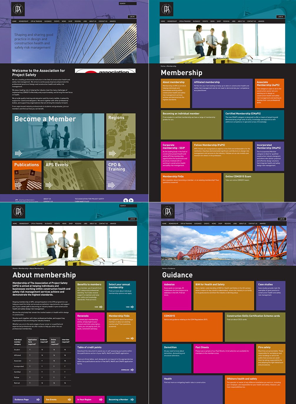
The old APS website was dated and difficult to navigate.
The main aim was to redesign and reorganise the many different services APS offers in a clear and simple way for easy navigation throughout the site.
How did I solve the problem?
-
I conducted a Design Evaluation with three users; asked the users to accomplish some tasks during their navigation of the site, and to "think aloud" to understand the behaviour of the user to identify all the possible issues.
Almost all of the users most found it difficult to navigate the internal pages, difficult to reach the area they were looking for, and they felt generally lost inside the site during the navigation.
-
I applied Jakob Nielsen's 10 Heuristics to analyse the site and found the following incongruencies:
-
1st heuristic 'Visibility of system status': it is difficult to visualize the 'Available actions'.
Solution: Making visible and clickable elements.
-
2th heuristic 'Match Between System and Real World': a metaphor icon was used as an action button in the card to navigate and the results were difficult to action.
Solution: Add visible action buttons.
-
6th heuristic 'Recognition Over Recall': the structure and multiple colours used in the internal pages made it difficult for the user to focus on the call to action in the box because there was no differentiation for each service.
Solution: Redesign structure to minimize the user's memory load by making objects, actions, and options visible.
-
8th heuristic 'Aesthetic and Minimalist Design': the site presented lots of colours and was very cluttered.
Solution: A clean and minimal design using a few colour tones and implement an uncluttered structure.
-
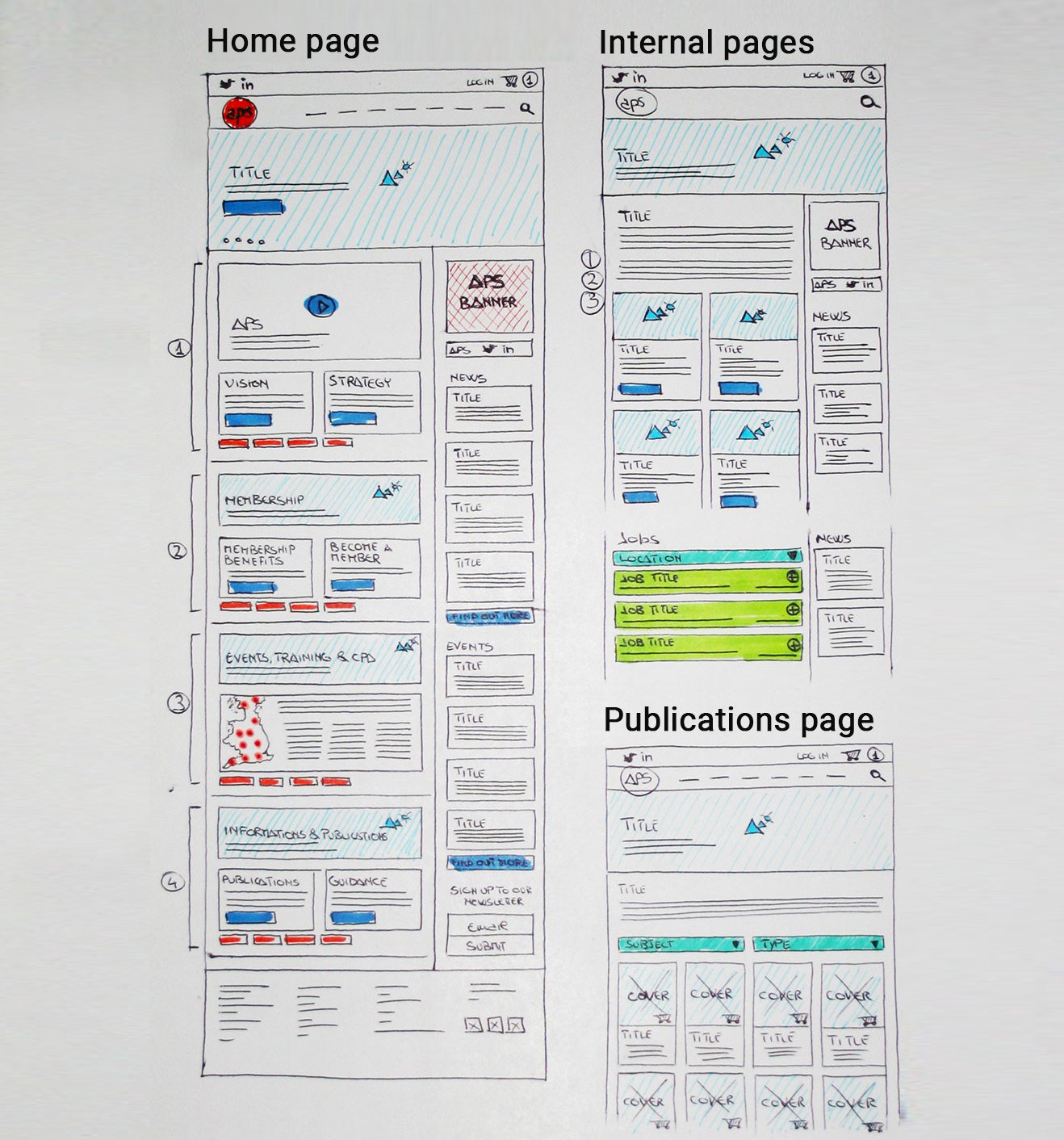
I designed a new site map, a new wireframe page structure, applying a minimal design.
Challenges and solutions
The 1st challenge was to
design a new Site Map
The old site presented 12 items in the navigation menu and relative sub-items for a total of 95 items. The items included all of the pages available inside the site, most of the page results were empty, without concrete information, or with sections that redirected to other main pages.
The solution was to showcase only the most important items in the navigation menu and only include relevant sub-items inside the menu. Most of the pages without concrete information were removed and those with necessary content were integrated as cards in the main relative pages.
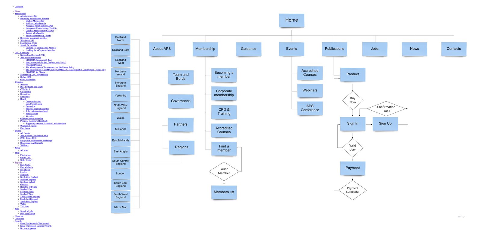
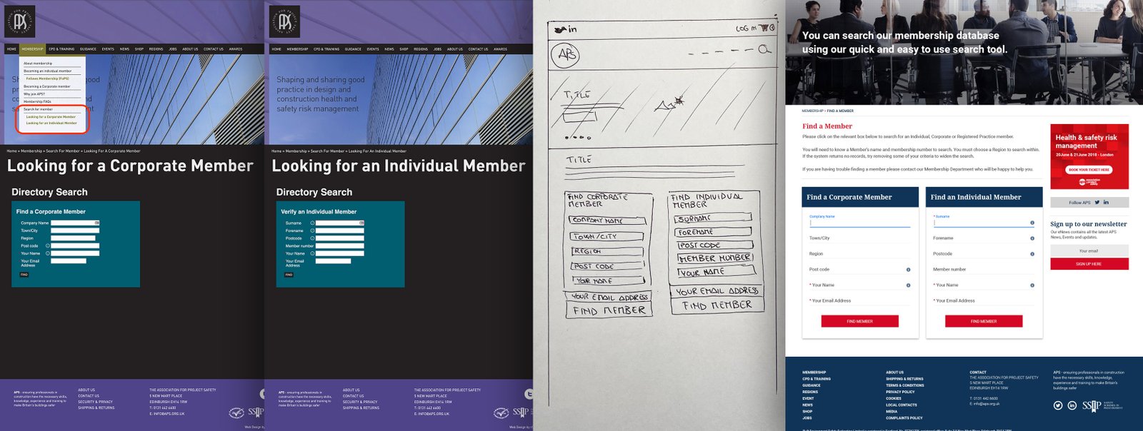
To minimize the site map and improve the user experience the Find a Member page was redesigned.
Find a Corporate Member' and 'Find an Individual member' page both showed empty results without content, also when the user was looking for a member they needed to switch between the two different pages.
The solution was to incorporate both search fields in a single page called 'Find a Member' that allows both search inputs on the same page.
Challenges and solutions
The 2nd challenge was to design the new pages structures to reduce the previous clutter and to clearly display the many services APS offers.
The solution was:
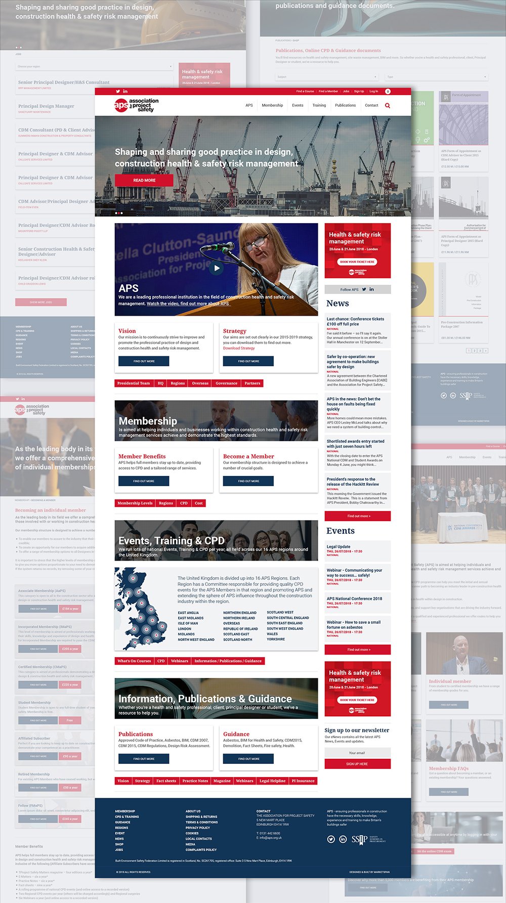
- Design a home page that showcases straight away the main services, divided by categories: About APS, Membership, Event & Training and Publications, each presenting a banner with a call to action, cards, and secondary actions buttons that redirect to relative pages.
- A standard structure for the internal pages.
- An Ecommerce structure for the publications.
UX
Wireframe
The desktop view was designed using a two columns structure; the left one is always responsive while the second one uses a fixed width to allow the possibility of adding an advertising banner with a width of 300px. "width: calc(100% - 330px)".
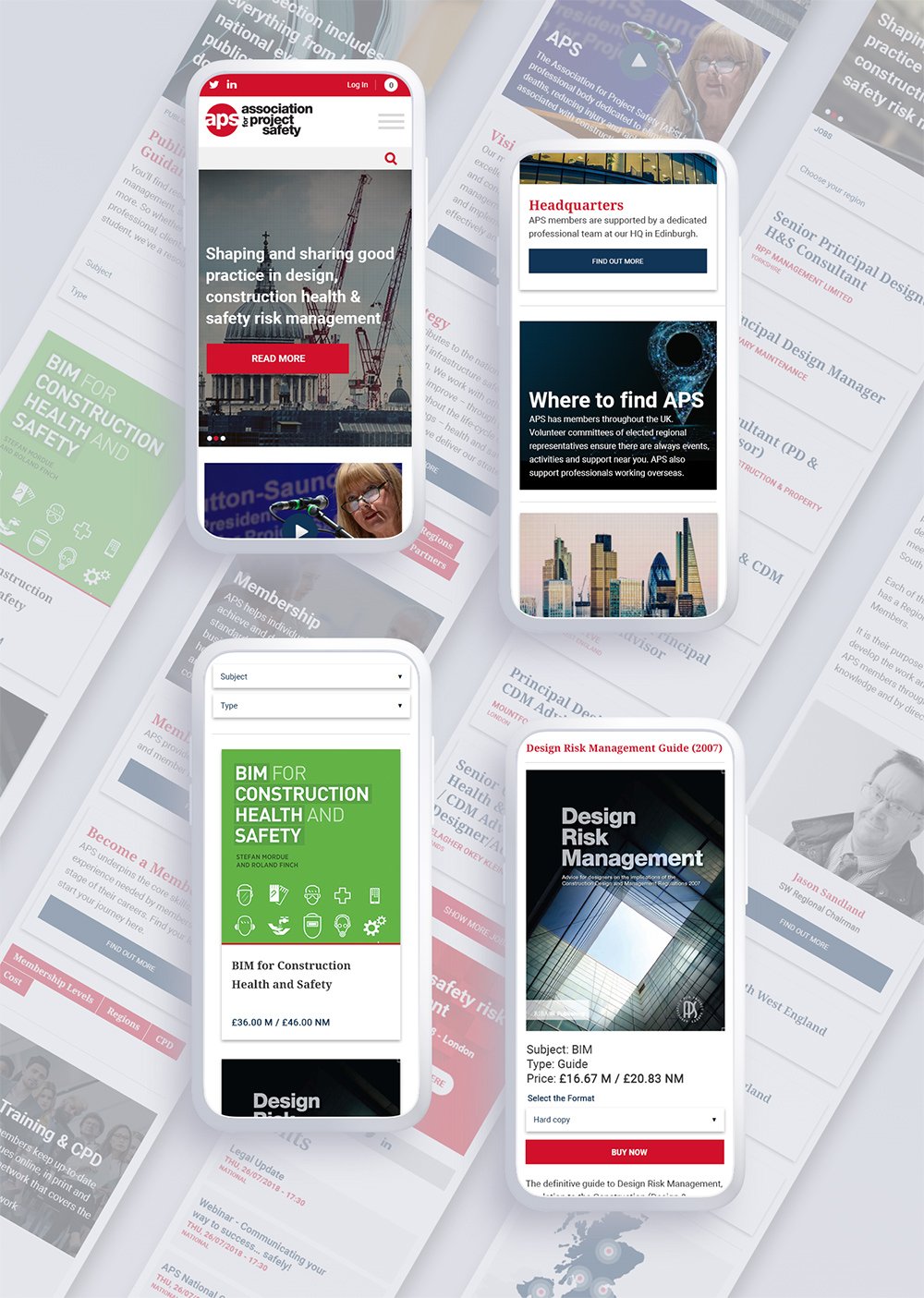
To optimize the view on mobile devices, I then added a breakpoint to rearrange the width of the right box so that the pages are responsive and display the news feed below the other section.
All cards are responsive with a matching height control between the two to maintain consistency if there are differences in the amount of card content. The content card also has a character limit of 400, to maintain uniformity of design.
Sketch
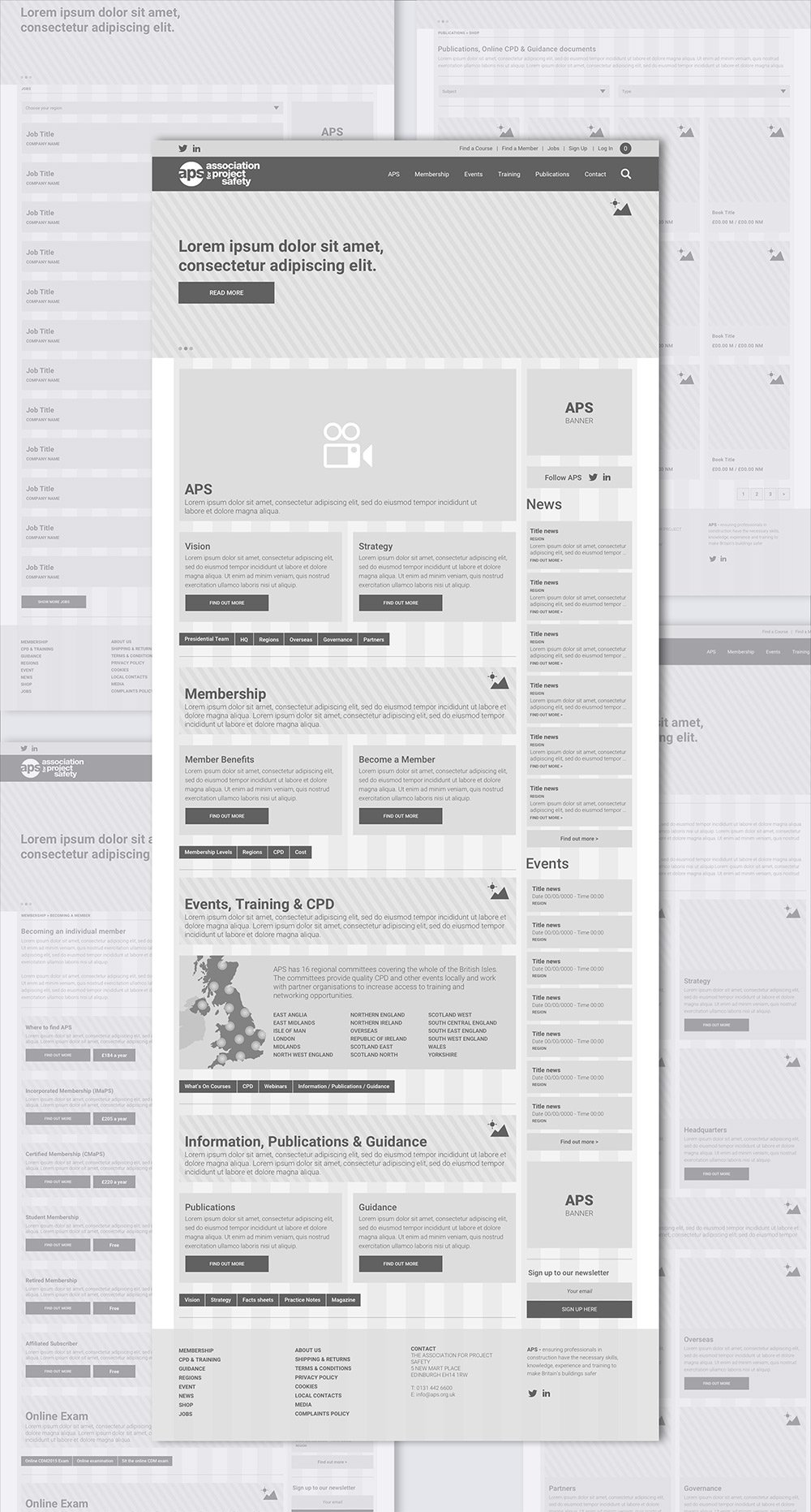
Analysis and redesign of the Events page
On the left-hand side of the old Events page, there was a filter option which listed all of the options, even if there were no results to show. All of the posts were displayed on the page and this created a really long scrollable page that was not visually appealing or easy to navigate.
The new page I designed included three filter options where the user can select events based on their interests; the first is 'region', the second 'topic' and the third 'duration'. The option categories available in the filters are only displayed if they have an event post with those particular categories.
This made the events easier to filter and reduced clutter.
When the user lands on the new events page, only 8 posts are displayed to not overwhelm the user with too much content. If the user wanted to view more events, a 'load more' button was added.
UX
Prototype
All of the animations and transitions and the modular structure was defined by a prototype to help the coder understand how the site should be built.
Flinto
Product
guidelines
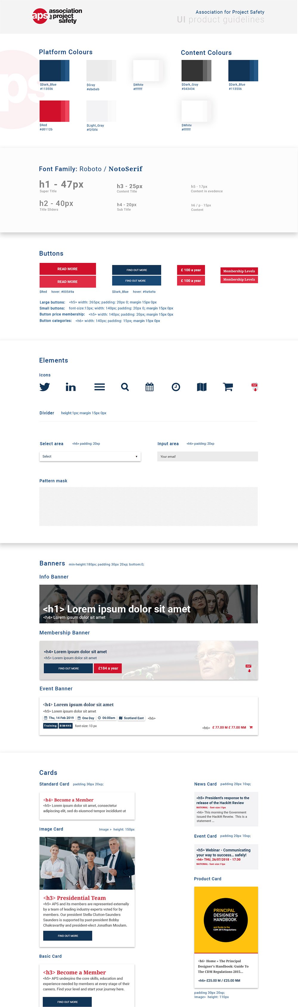
The UI library reflected not only the new brand identity but also solved functionality problems by including a set of reusable components to build most of the pages following an atomic design sistem.
Every atoms, molecules and organism was tested against with real content and in different contexts.
Sketch
UI
Visual layout
The simple design removed the clutter from the previous site so that users can focus on the services.
The users of this site are predominantly professional members who expect to quickly find what they are looking for in a clearly presented way.
The old site used a multitude of different colours and lacked style consistency, which made the site unclear and cluttered. In the new site, I kept only blue, red and light grey, and images were used in place of colour to give points of interest and engagement.
SketchPhotoshop
UI
Mobile layout
The block structure defined in the wireframe was designed to become responsive and simple to use on mobile devices.
Sketch
Outcome and takeaways
- Analysing the data content and services APS offer was essential to understand how to structure the site, thinking about the different routes different users would take.
- Choosing to use a card structure divided by sections created an organized site and keeps the site fresh with up-to-date content; i.e. when a new page is created a card is generated which can be showcased in a relevant area of the site.
-
In contrast to the old text-heavy site, making it possible to add relevant images to each card makes the site more pleasant and engaging for the user to navigate. It also gives the user a visual association so they can quickly find what they are looking for.
- Designing different components (including banners and cards) helped the design to develop quickly and kept consistency on the entire site.